Communicating with bookbinding
As Jhumpa Lahiri writes in her essay "The Clothing of Books" the cover, and by extension the entire physical book, is "the door that allows us to enter the text enclosed within pages", but stripped of its aesthetic function. Above all, it is the key to sales.
By Lorenzo Capitani | On PRINTlovers 101
Of the 82 books submitted for the 2024 Strega Prize, only 8 passed the mark of 5,000 copies sold, 26 titles passed 1,000 copies, and the remaining 48 titles failed to sell more than 300 copies: yet the book industry is in constant excitement. This turmoil is being created by the many initiatives of publishers, sector associations, festivals, and, for some time now, social media - TikTok and Instagram, most of all, the bitter enemies of reading but excellent allies of book marketing. The sector has grown by 300 million compared to 2019; it ranks first in Europe and sixth in the world. Physical bookshops, increasingly visited by young people, have been consolidating their position as the first purchasing channel (in 2023, 54.7% of the trade market passed through here), despite Amazon remaining the leading bookshop in Italy, and produce 53.8% of the chain’s turnover. The entire sector seems to be on the right track, finally managing to absorb new trends, adapting, intercepting readers, and creating unprecedented and ever-new opportunities for contact between the public and books in their various formats, including audiobooks.
Publishers are understanding better than before how to attract new readers and occasional, distracted readers. What are the reasons for this new vitality? As always, a combination of factors. Indeed, one lever is the air of renewal in publishing houses with new young talent, now born in the digital age - who can intercept potential new readers when they can’t create them - coming down from the ivory tower of fully committed literature and even attracting the so-called Booktokers, the generation of young people between 12 and 18 years old who can boost the sales of a title with a hashtag.
But the book also has a significant ally in technology, which has raised the focus on production aspects and their sustainability, not only economically: the goal is the right number of copies at the right time at the point of sale, avoiding waste of money and resources. Digital printing, now adopted by large publishers, has concrete applications in reducing print runs and stock management and in the ecological footprint: it is a balance between near just-in-time and process optimisation, now achieved with algorithms and the study of models. The book sector, compared to other sectors, which, to optimise, have reduced their offering, on the contrary, has expanded it; it has disentangled itself from short and micro runs, web-to-print, and print on demand. So, the 48 titles going to Strega with less than 300 copies sold are not a negative figure but the exact snapshot of a sector in line with the demand of its market. If the chain allows it, it is not necessarily bad that publishers' catalogues remain full of titles: the era of six-figure print runs is over, but this does not mean that the offering should be reduced.
The book – packaging for itself
There is, however, another aspect that needs to be taken into account to explain the firm position that books nevertheless maintain and that consequently also conditions other non-publishing printed matter: the marketing that promotes and communicates the book not only as content but also as packaging for itself, just like any other product, with a dual function, however: as an object to be promoted and as a promotional tool. And in all this, the print-book combination is the most active and constantly on the boil. The cover, and by extension the entire physical book, as Jhumpa Lahiri writes in her essay Il vestito dei libri - The Clothing of Books - (Guanda), is "the door that allows us to enter the text enclosed within pages" but stripped of its aesthetic function. Above all, it is the key to sales.
If, as George Eliot writes in The Mill on the Floss, "Don't judge a book by its cover", it is equally valid that a book attracts us by the appearance of its cover. So much so that the idea of Jan Tschichold, who designed Penguin paperbacks in 1935 and sanctioned for the first time the prevalence of the graphic identity of the publisher or the individual series over the work itself (the exact opposite of what happens with music or films), works perfectly well even today in the age of Amazon. And yet Seth Godin, the marketing guru who, in 2014 with his Poke the Box, argued that "the marketplace needs the title as a search string - it is not necessary for the cover, which can have its own unchained image, which should also work in a very small size", was wrong. For Godin, a book on the web no longer needs a spine, flaps, or special papers but only a strong, recognisable image. But who said that books in the age of e-commerce are no longer a physical experience but only a visual one? You only have to go to a bookstore to discover that the book is more physical and material in the digital age than ever.
Bookshelf sirens
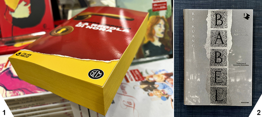
The number of pages has grown; 'bricks' do not scare publishers or readers, and these bricks must be beautiful to attract. This has also led to increased processing and ennobling, bringing back into vogue an enhancement such as colour cutting that had all but disappeared. Created to protect books, it had remained the prerogative of a few artisans and the preserve only of valuable series such as the Mondadori Meridiani with their unmistakable indigo cut. Today, the cut of many books, even of consumer series, has not only returned to being hot-labelled but is even printed, bringing to an industrial scale a hobby practice of many readers, especially readers of fantasy sagas, of decorating their books with watercolours. From reels on social media, creatives have intercepted it and turned it into a marketing lever. They range from the classic hot gilding in metallic or Pantone colours to full single-colour printing as in SEM's Italian Tabloid series to the reproduction of texts, motifs, friezes and textures obtained by pad printing or, on more industrial volumes, digital printing as in the beautiful Babel by R.F. Kuang for Mondadori. This book is perhaps one of the most representative examples of the enhancement of the physicality of the book object, especially in the fantasy vein: an absolutely tactile 600-page volume, hardback with the board in optically white marked paper, covered in crisp white GSK printed in black, hot silver and silk-screen printed, with the colour cut-out printed with an inscription and an arcane texture. Babel is so cult that there are dozens of different editions worldwide, even with limited edition decorations.
The tangibility of the book
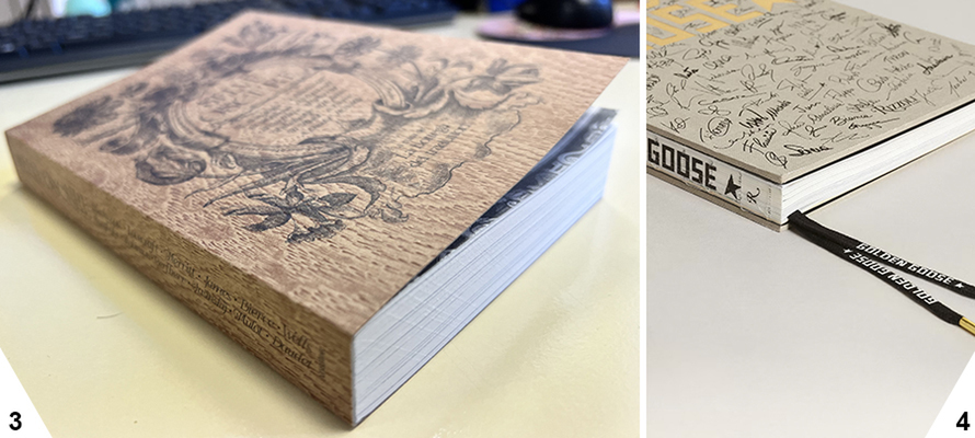
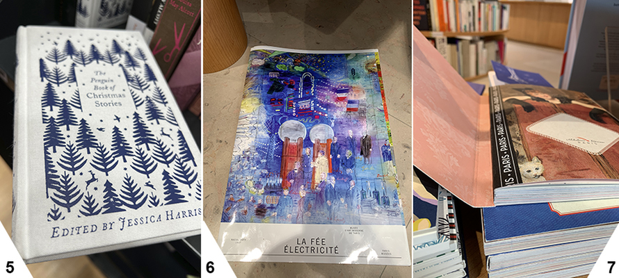
Of course, the traditional glossy, embossed plasticised dust jacket survives, but it is now taken for granted, and art directors are looking for the craft effect so cherished by certain sustainable packaging. And so paper returns to its original material in Selve Oscure by La Bottega dei Traduttori with an Icma Woods cover that simulates wood in every way, including grain. Bookbinding cloth is also back, but not Setalux, which smacks of preciousness, but Assuan, Bukram, Cialux and Canapetta, rough-looking materials made of mixed cotton-linen-viscose fibres with a very natural finish, as in the volume for the 20th anniversary of the Venetian sneakers company Golden Goose in which the cloth is laminated to a 5mm cardboard to form a Bodonian binding with a raw cut and with the thread stitching visible on the pad-printed spine. Penguin also uses bookbinding cloth in its Clothbound Classics series, created by designer Coralie Bickford-Smith, lined in linen cloth and hot-printed: a maquillage that lends preciousness to a series of classics in pocket format and with a decidedly sustainable look.
Equally covered in red canvas screen-printed in white and all-to-be-touched is the unusual exhibition catalogue "Art of Change, New Directions from China", created by the design studio Stinsensqueeze: the volume is a loose-bound paperback with the spine to the right and folded in on itself: once unfolded, it should be read upside down, not like Japanese texts from the last page, but generally from the first, only that this one is at the bottom. In short, it is as physical as possible: it must be handled to read and understand it. Just like the catalogue produced by the Musée d'Art Moderne de Paris on the occasion of the restoration of Raoul Dufy's monumental fresco La Fée Électricité: 600 square metres consisting of 250 panels, commissioned from Dufy by the Paris Electricity Distribution Company for the 1937 Universal Exposition in Paris, must also be handled. The catalogue is equally monumental: 50 x 70 cm closed without binding to recall the panels, on a white paper with a highly polished finish to give the same effect of blinding light that the fresco gives and should have given electricity to Parisians in the early 20th century.
The rediscovery of three-dimensionality
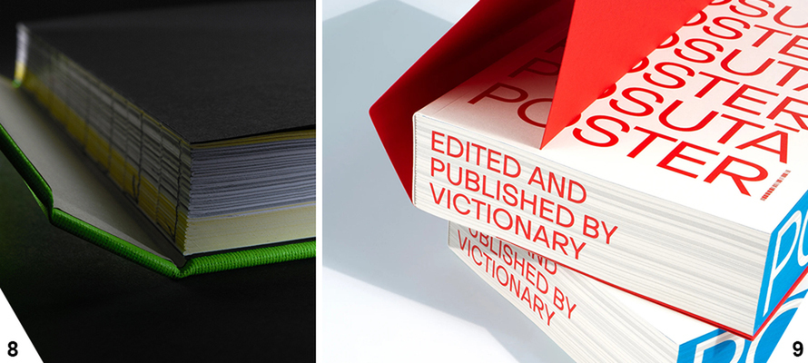
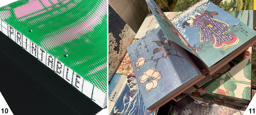
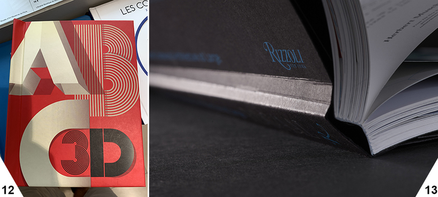
But how do volumes like this sell online? Are publishers, creatives, and art directors only resigning themselves to the cover plate showing a ‘strong and recognisable image’, as Godin claimed? Absolutely not, otherwise there is no explanation for the abundance of rounded corners, Bododian bindings, Swiss bindings, stitched hardbacks with the spine visible, and Singer wire that cannot be seen in the rectangles intended for covers on online sites where only the front view of the plate goes. Yet these elements are present and invested in, indicating that the book's physicality remains inescapable. This is also demonstrated by the choice of the Parisian publisher Alibabette, which has a whole series of notebooks and notepads linked to the Swiss with a gauzed and printed spine; or Taschen's Nike volume dedicated to the designer Virgil Abloh, who reinvented the culture of sneakers, also linked to the Swiss but with a visible spine; there’s also the Hong Kong publisher's series of hardbacks using this type of binding as an additional dimension of the book The Printable Volume - about the world of printing and its techniques. This has the fold of the signatures printed to form - once the cover is open - the title of the book, stitched in green thread; it also has perforated pages to be taken out of the book and inserted in a ring binder like the catalogues of yesteryear. Posutā Poster, dedicated to Japanese posters of the 1964 Tokyo Olympics, also has every available surface printed. Destructuring the book and multiplication of the useful surfaces is also used by Edition Azan, which, in its series on the masters of Japanese Ukiyo-e art from Hiroshige to Hokusai to Utamaro, chooses a Concertina binding: two hardback quadrants act as the front and back covers for a very long series of sheets that are not sewn but folded and held together by glued flaps: no spine, no binding, just a slipcase for storing the closed volume.
Virtuosity becomes the norm
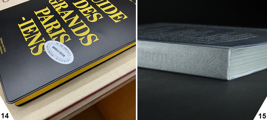
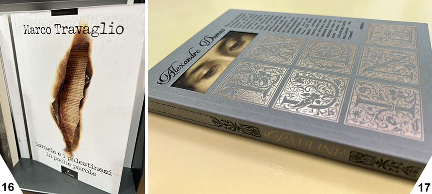
Exceptions, exercises in style for their own sake, such as Marion Bataille's ABC3D, published in Italy by Corraini, a virtuoso pop-up in which each double page gives life (literally) to a letter of the alphabet? I wouldn't say so: these are books on the market, at affordable prices, intended to be read and not just to be beautiful objects. One example is Architecture at Large: RDC/AAL by interior designer Rafael de Cárdenas published by Rizzoli: an Optabind soft paperback in which the cover is glued to the book block only for a small portion of the plate and the spine remains free. Or the many other Dutch hardback titles covered in paper, like the historical Touring Club guides, or in plastic, such as the Guide des Grands Parisiens 2023 by Magasins Generaux, on sale for a few tens of euros with a yellow cut-out, or again OMA NY: Search Term in which a transparent screen-printed PVC was used for the cover that covers a binder's cloth.
A significant fact emerged at the last Turin Book Fair: physical bookshops have consolidated their position as the top sales channel for books (53.8%). This not only stems from a publishing offer capable of intercepting new needs and new audiences, from cover prices with a growth rate below inflation and from offerings aimed at bringing readers back to bookshops, but above all, from the ability to keep them there and stimulate them to buy, attracting them with beautiful books. It is no coincidence that 25% of those who chose bookshops said they rediscovered the book there.
The external appearance of the book not only attracts or connotes a series or a publisher but also winks at the reader by alluding to the content, the plot, and the atmosphere, and does so with graphics, images and typography, indeed, and bookbinding. Israele e i palestinesi in poche parole (Israel and the Palestinians in a Nutshell) by Marco Travaglio for Paper First, with its austere cover with flaps, hints at the tragic nature of the conflict thanks to the burnt-out die-cut on the front cover, which reveals a Torah as if among the rubble of a torn-down wall. A glimpse into the book's interior and the mystery of its plots is also used for Dumas' early novel Pauline, where a sad woman's gaze appears from the die-cut blanket in Neptune dust.
In short, the focus on the aesthetic presentation of the book attracts the public and underlines the importance of the book as a physical object. This marriage of content and packaging is proving to be fundamental in the digital age, in which the book continues to be a tangible, multi-sensory experience. The evolution of bookbinding techniques, together with the creative virtuosity of publishers and art directors, helps to keep alive the interest in the book as a cultural product. The book's external appearance reflects its content. It becomes a tangible invitation for the reader to explore the pages that lie within it because, as Calvino writes in Mr. Palomar, 'only after knowing the surface of things can one go in search of what lies beneath. But the surface of things is inexhaustible'.
05/07/2024


