Watching construction sites
Not just an umarèll pastime, construction site covers are vast printable surfaces that can convey information, updates, and even beauty, helping city dwellers overcome the inconvenience of construction work.
By Roberta Ragona | on PRINTlovers 102
The 2021 edition of Zanichelli's dictionary defines the umarèll as follows: "(Bolognese dialect) a pensioner who wanders around, mostly with his hands behind his back, at construction sites, checking, asking questions, making suggestions or criticising the activities taking place there."
It is a word so apt that it seems to have existed forever, but it was invented less than twenty years ago by writer Danilo Masotti. Watching the building works, however, is no longer a recreational activity for umarèlls. In recent years, large construction sites and the idea of the city as a shared space have changed. Besides safety and compliance with regulations, it has become critical that the construction site can talk about itself and its function in the urban space, especially for large works of public relevance. It performs a function of communication, dissemination, and even artistic experimentation.
The construction site as a work of art
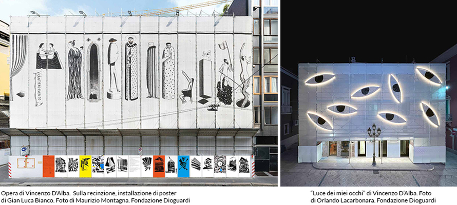
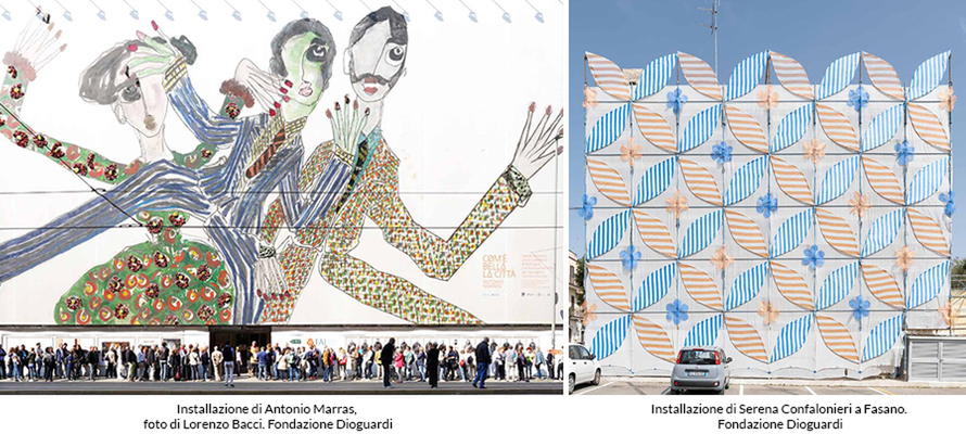
The idea of the artist's building site comes from afar. In the case of the Dioguardi Foundation's 'Cantiere Evento' format, the first example dates back to 1993, as Francesco Maggiore, the Foundation's current president, explains: “The idea arose from a need felt by Professor Dioguardi, who had won a competition to build an underground car park in Place des Célestins, in the heart of Lyon. Gianfranco Dioguardi posed the problem of alleviating the discomfort of a construction site in an urban space as lived-in as the city centre and what actions need to be implemented to make the construction site accepted by the community. Thus, the concept of the ‘cantiere evento’ (construction site event) originated, a series of initiatives for the benefit of cultural, educational, and artistic citizens. In 2016-2017, the first ‘cantiere evento’ took place in Italy on the restoration of the Teatro Lirico in Milan. These interventions are particularly relevant in cases where construction sites have a very long life. In this way, in addition to cushioning the impact of the work on the urban context, the good is already made available to citizens during the works. In five years, we have had over 3,000 people enter the construction site, from the youngest children to the elderly, always in safety." The building site, therefore, is a 'talking work'. “In the restoration of the Teatro Lirico, the building site was covered with huge perforated PVC prints designed by Antonio Marras. The covering was printed and then taken to a theatre workshop where Marras added pictorial interventions. The third step was the application of three-dimensional inserts of flame-retardant construction site fabrics, which were very light and designed to avoid the sail effect. The technological, safety and regulatory limits should be a creative push: the materials are those of any construction site, but imagined differently, they become a resource."
An essential sense of the project is to inform citizens: "For all our construction sites we produce brochures, we communicate through social media and the construction site itself: the roofing surfaces are the 'skin' of the construction site towards the world. For the construction site in Milan, we involved NABA students in a photographic workshop and then exhibited their photographs in a large format, then printed on PVC. At the same time, for the construction site event at the castle in Ginosa, we took Maurizio Montagna's photos all over the city, displaying them as 6x3s on municipal notice boards. The construction site expands in the city not with its discomforts but with the story of the centrality of the good and the importance of taking care of it.”
From discomfort to evolution: reversing the perspective
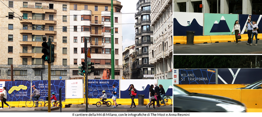
And it was precisely the aspect of communication with citizens that was one of the cornerstones of Mattia Reali's (MOST) and Anna Resmini's concept project for the construction site of the 'blue' M4 line of the Milan metro: “For the M4 works, we designed the concept and took care of the the way it was set up on a small number of pilot sites, then the set up on the whole remaining extension of the works was the subject of a subsequent call for tenders. The requirements were broader than simple construction site coverage: we had to reason about the long-term impact on crucial areas of Milan that crossed the entire city centre, businesses, residents and those who live there every day for work or study." Reali continues: "We also developed the entire infographic, developing the first metro 4 map. We took a series of conventions from the Milan metro communication canon, such as the 45-degree lines classic to transport maps, so that it could be superimposed on the city map. In addition to the font used inside the Milan stations, we combined a monospaced font to give the idea of work in progress. To the blue of the M4, we combined a series of bright colours that worked well in contrast and had few details, a type of illustration that could be easily enjoyed at speed."
Anna Resmini emphasises: "When you live with a construction site, you have to deal with a double discomfort, on the one hand, the noise, the disruption of space, and on the other, the fact that you do not know what is happening. So we worked precisely on the change of perspective: the construction site is an inconvenience, but it is also an opportunity in which the city changes to provide more services, to grow. The visual concept we started from is an analogy: the network of a city from above resembles the veins of a leaf, that is, a living, evolving organism. In this view, the construction site is a cell, a generator of change and growth. From this analogy, the entire creative idea and communication design developed. For example, along all the discontinuations of the building site, we thought of a pattern that would take up this idea of plant weaves, which, however, are also the weaves of city mobility, how people move around. The illustrations are laid out in pairs; if, in one, there is a tram moving on a rail, in the next module, we realise that that rail runs on the grid of a leaf. We also developed visuals with examples of movement outside the city, like organisms in relation to their environment.”
Also in the case of the M4 construction sites, the customs of construction site work provide a structure on which to build creativity: "In the execution phase we adopted a modular approach, working on blocks established according to the dimensions of the modules of the roof, so that elements of graphics and illustration could be juxtaposed freely and in the case of the more teaching-oriented and informative modules there was no interruption of information between one discontinuation and the next. In this way, the layout could be modulated according to the individual site's needs, directing the more textual and informative parts to the areas with the most pedestrian traffic, and the illustrative parts - more usable even from a distance - to the areas with car traffic.”
The technical challenges of printing and implementation
We asked Alberto Masserdotti, CEO of Gruppo Masserdotti, and Ninni Bonica, founder of Digitalmedia, how these design aspects fit into the work of those involved in printing and commissioning very large format materials.
The first issue when faced with this type of project is one of framing: on a regulatory level, the framework needs to be more cohesive, with differences at local, municipal and national levels. While all bodies have transposed a regulation, local aspects can be very different, especially in the case of buildings that are bound by the Soprintendenza Archeologia Belle Arti e Paesaggio (Superintendent of Fine Arts, Archaeology and Urban Landscape). The frequency with which a municipal office is faced with this type of initiative also influences the ease of production: in Milan, for example, there are relatively well-established procedures for projects that hold together the functional aspect of the site; for smaller municipalities where this type of hybrid operation is less frequent, the communication and branding and advertising aspect and the artistic aspect, all becomes more complex.
The second issue is the safety of the printing materials used: lightness so as not to burden the static of the scaffolding, fireproof treatment and windproof effect. During installation, checks are made by specialised engineers to certify the design data. It is necessary to avoid the sail effect. In this, it is essential to have the direct experience of the printers on site to assess the exposure to the elements, and the methods of installation to ensure the best performance, both functional and aesthetic - for example, to determine where it is possible or not to make horizontal welds between the PVC roofing, which save material, but on the other hand have a much lower resistance to gusts of wind, thus exposing the roofing to the risk of tearing.
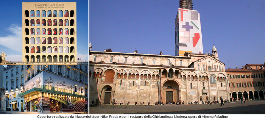
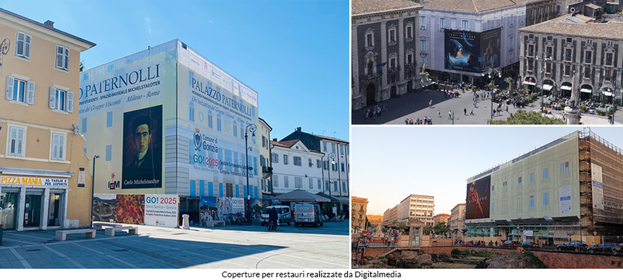
However, safety also has an aesthetic aspect: a construction site can extend for months and sometimes years, so the long-term resistance of the printed materials becomes crucial. Particularly in cases like those of art building sites - such as the restoration of the Ghirlandina Tower with Mimmo Paladino's works reproduced on covers by Masserdotti or the Quirinale Gardens with covers by Digitalmedia - where the cover also has a visual value, the substrates must guarantee long-term durability, otherwise the aesthetic value of the work would be lost. In the case of UV printing, the inks are guaranteed for two years, and their durability goes hand in hand with the appearance of yellowing of the sheet after prolonged exposure to the weather and the elasticity of the sheet. Sheets are exposed to significant temperature fluctuations and heat stress: PVC is a plastic material, so how it will react in situ must also be calculated.
Is there life after the construction site?
The last aspect concerns the end of life of the materials: in the case of micro-perforated material, the micro-holes, due to their conformation, tend to collect particles more easily with a yellowing effect on the sheet, being in perennial contact with the dust generated by the construction site. This is something to consider when discussing sustainability: for some materials, reuse is more straightforward than for others. For example, solid PVC sheets can be reused for commercial purposes easily, as the Freitag brand does, or to protect barns and canopies, as swimming pool covers or as a base for land-fill. Of course, these reuses are evaluated on a case-by-case basis in accordance with legal regulations depending on the agents with whom they came into contact during the work.
In the case of an art site, however, the end of the work is not necessarily the last step: “The construction site is by nature a changing space, so documentation work becomes essential. For some materials - such as artist's roofs and installations - we are creating a physical archive of the works created during the various ‘cantieri evento’, a testimony of what remains of an ephemeral event," says Francesco Maggiore.
These ephemeral experiences can, however, set in motion virtuous mechanisms for rethinking public spaces, as in the case of the exhibition in Denmark that in 2019 described the work on the M4 construction site: "For Italian Design Day 2019, to coincide with the opening of the Citirynghen, the capital's new circular metro line, we were invited by the Italian Embassy in Copenhagen to participate in the programme of events with M4M Milano for Mobility - A project of graphics, illustration and design for the city, an exhibition and a conference on the addition of construction sites to the urban landscape through graphic design, dedicated to the graphic concept at the origin of the decoration of the M4 construction sites," say Mattia Reali and Anna Resmini.
In short, when we look at the construction sites, we no longer find only the umarèll but also fans of graphic design, urban planning, and printed communication.
