Anatomy of the printed product
You’re not being quirky to ask yourself how a volume, packaging or shopping bag is made. Most of the time, it is the printed product itself that tells us: there are few things that cannot be deduced directly. And this comes in handy when we have to make a similar one or just come across a solution we hadn't thought of, or it helps us not to make mistakes and call things by their correct name. Let's pretend to be Sherlock Holmes to discover how much a printed product can tell us about itself.
By Lorenzo Capitani | On PRINTlovers 94
For almost 90 years, it has been presented as 'one of the great treasures' of the University of Michigan Library: in reality, Galileo Galilei's 1610 manuscript, in which the astronomer revealed the presence of four stars in orbit around Jupiter and thus proved that not all celestial bodies revolved around the Earth, is a glaring fake. The observation of bodies orbiting another body other than the Earth was true; the paper was not. The discovery last August was made by the Indiana Jones of forgeries, Nick Wilding, professor of history at Georgia State University. He had already shown in 2012 that an edition of Sidereus Nuncius, also by Galileo, was false. What betrayed the forger then was the ink; this time, it seems to have been the paper.
This is just the latest of many fascinating stories of chance finds, mysteries and incredible discoveries of manuscripts and printed books. Sometimes they are matters for philologists and collectors; at others, they are crucial turning points for our culture. Two of them above all: Cicero's De Re Pubblica found in 1819 by Angelo Mai in a 7th-century manuscript by scraping off St. Augustine's Commentaries on the Psalms; and the famous and very false Donation of Constantine uncovered by Lorenzo Valla in 1440 and on which the Church based its temporal power for centuries. Stories poised between philology, mystery and, as the experts say, entypology: the fascinating discipline that deals with the classification of printed products according to their historical, functional, technical and aesthetic characteristics. But there is no need to go in search of the mythical second book of Aristotle's Poetics dedicated to the comedy of which Umberto Eco speaks in The Name of the Rose: just any printed product is enough to take on the role of Sherlock Holmes and discover how much it can tell us about itself. Because knowing what he looks like can be very useful.
The five senses at work
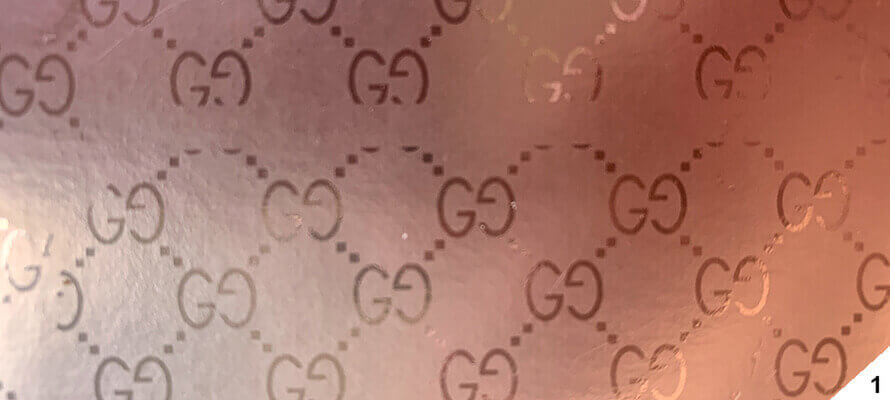
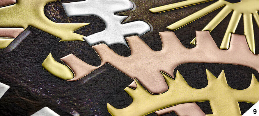
To tell the truth, as insiders, more or less consciously, we always analyse a printed product when we turn it over in our hands, touch and leaf through it, look down at the spine and assess the print and packaging. Some people open it and observe its pages against the light; some rub the paper between their fingers to guess its hand and weight; some even sniff it. It is not a common habit to ask how a volume, packaging item or shopping bag is made; most of the time, it is the printed product itself that tells us: there are few things that cannot be deduced directly. And this comes in handy when we have to make a similar one or just come across a solution we hadn't thought of, or it helps us not to make mistakes and call things by their correct name. Sometimes it is a question of materials, techniques, or even the order of the processes: it is the right sequence of printing, plasticising, glossy varnish, and matt varnish, for example, that gives life to the well-known tone-on-tone texture of the double G of Gucci's packaging: to look at it like this, it seems easy to achieve but in some cases, it is not at all.
In all this, our senses are our best allies: sight, touch and - why not? - even smell, because some inks almost always have a distinctive smell, like certain paints. But we must not stop at the surface: we also need a fair amount of curiosity because the printed product must be analysed, turned over and over, sometimes taken apart completely or scrambled because often some secrets are literally hidden between the folds. For example, in a singer wire wrapper on the cloth-covered plate, to find the wire, you have to unearth it by disassembling the volume, just as in an Optabind paperback, the cover has to be removed to expose the spine cover. Or even a shopper has to be taken apart to discover that, apart from the print, it is more often than not 'just' a creased, folded and glued sheet.
Doing things methodically
Undoubtedly the entypological method, with its taxonomic and systematic approach, can certainly be a guideline. Graphics manuals start by classifying prints according to use and function and then go into detail and describe the parts and characteristics of each type of print. We should precisely take this approach and analyse a printed product in each of its parts, from the most external and evident to the most minor and hidden. This may be simple for a flyer, a leaflet, a label, an invitation or a business card, much less so for a stitched hardback volume with a slipcase made up of many more parts.
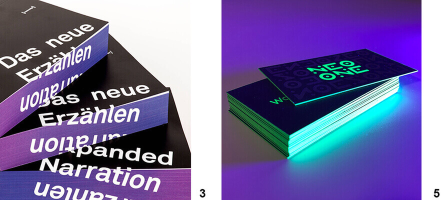
But how is it done? Practically speaking, it is a matter of reconstructing the specifications of the printed matter as if we were the ones who were to commission it from our printer: type of printed matter, parts, colours, type of printing and paper, finishing, packaging, and so on... But that is not enough, because once we have made a list of the parts, understood how they were printed or finished and what materials were used, we should also try to reconstruct which processes were carried out and in what order, not because we are the ones who will physically carry them out, but precisely because we must assess their feasibility and effects. Let us consider the cutting sequence of three classic book publishing bindings: a paperback volume with flaps, one without and a Dutch cover. In the first case, the volume is first trimmed at the front, the cover is encased, and the head and foot are trimmed; in the second case, the cover is encased, and the three sides are trimmed; whereas with the Dutch, the volume is first trimmed on three sides and then encased. What about colour-cutting on the pages? How is it done, and when? Having an awareness of the stages also means having evidence of how many jobs have to be done, which ones inline and which ones out, and - since every job is a cost - it also means having an awareness of the costs and being able to make an estimate. It is no coincidence that we also offer the column ‘How Print is Made' in every issue.
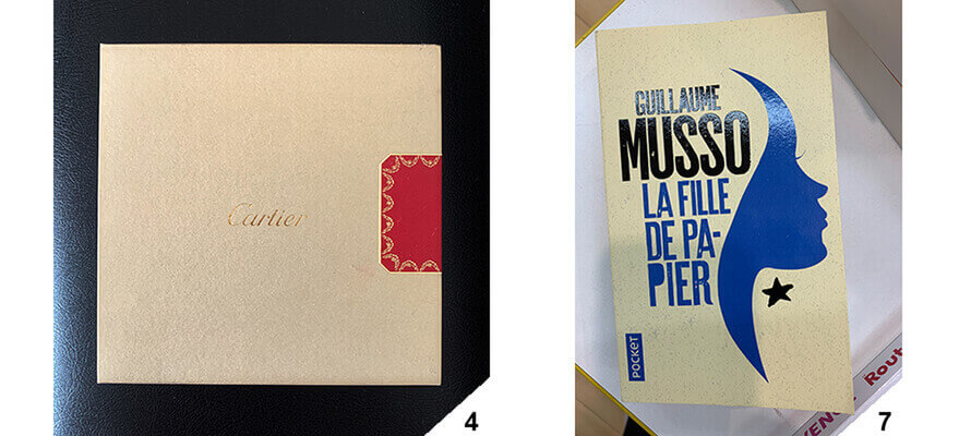
Let's take the drawstring in the picture: apparently, it is a simple back cover closed at the head and foot with a hot-printed frieze also hot-printed and applied to the centre of the opening at the front. But it is precisely that frieze that complicates the workmanship. First of all, the hot stamping borders the frieze; furthermore, the garlands of the motif must fall exactly to the cut, and the front must be perfectly in register with the back. To do this, the frieze was designed as a back cover, hot stamped with such an abundance that when it was die-cut, it had a uniform gold border, and finally, the drawstring had the exact quantity on the side to be opened that the back cover of the frieze could be recessed on the drawstring, glued and trimmed. This is just one example of how a seemingly simple result hides technical pitfalls.
Colours and thicknesses
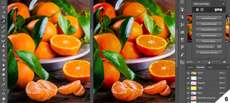
Let’s now try to apply the method by starting with colours and printing techniques that must be considered more or less together, proceeding by exclusion: we can start by asking if there are spot colours. We look for solid, non-screened graphics that can give us an answer, such as backdrops or endpapers printed in one colour. If we find them, what special colours are used will only be told us by a comparison with the coated or uncoated Pantone depending on whether the paper is glossy or matt. Of course, it could have been varnished and the rendering slightly altered, but we are not making an anastatic copy... In any case, let’s not stop at appearances: the spot colour could have been used not necessarily on its own, but as a reinforcement in images, for example. Now, unless the printed product is an art, photographic or particularly valuable volume, we could almost certainly rule it out, but if there are particularly vivid photos, very definite and neutral whites and blacks, it might be worth resorting to the loupe and looking for traces of a possible hexachrome (green and orange in addition to the four-colour process) or blacks or grey Pantones for reinforcement. Look for where the register is most difficult to hold, such as borders, negative text, fillets, and text. But Pantones could also have been used on their own, for example, in more straightforward but impressive printed matter such as business cards, invitations, and flyers, or there might not even be printing in the strict sense of the word: it is not necessarily the case that only ink has to be used, whether offset or digital, but one can also 'print' with hot foil, embossing or debossing or varnish, or even screen printing. In these cases, it may not be so easy to juggle the different techniques because a lot depends on how they are used, on which media and for which types of print. Let's think of the possibilities offered by digital finishing. Embossing can also be obtained digitally using thick polymers that give the same effect as embossing: what betrays, so to speak, the digital process will be the flatness of the paper that is not altered by the plate, just as for metallic, iridescent or pastel foils there will be positive thicknesses, sometimes even important ones, and not negative ones as with hot printing, which requires a minimum of pressure anyway; furthermore, with the lens, you will not even see traces of ribbon tearing. On the contrary, those who resort to digital finishing generally seek precisely the high thickness and often choose them for convenience based on the print run.
Which technique?
How do we distinguish between the different printing techniques apart from the enhancements? Once again, it is a matter of looking for meaningful clues. And paper is one of them. If our printed product, e.g. a flyer, a catalogue, but also a book, uses a paper that is not overly weighted (in roto, we do not normally go beyond 130 g) and with conical embossing marks at the head or foot, we could be almost certain that it was printed in roto. Confirmation will come from the type of printing: if we assume that many copies may have been printed, it is almost a certainty; in addition, roto leaves unmistakable marks: the paper is always a little crisper than the flat one because it has passed through the drying oven; the register, however accurate it may be, will never be perfect and, above all, the marking will always have some minor wrinkles, usually at the head, because the folding takes place at high speed in the machine and, no matter how small holes are made, or the paper is moistened to make it easier, there will never be a "clean" fold like the one obtained by folding a sheet of flat paper out of line. In addition, with rare exceptions, rotos do not have a coating unit, so there will be no special or spot finishes on portions of the page, and there may be some translucent halo due to the dampening solution or uneven drying. Other unmistakable clues are the glue wire wrapping that holds the printed pages together and the needle holes at the foot of the scoring, if not trimmed. Obviously, we would be looking at a flyer, for example, which in itself has a high distribution and consequently high circulation, and this inevitably leads back to the press, but needles are also present in newspapers.
Digital printing, on the other hand, which is now absolutely established, competitive and used for printed matter such as books, even valuable ones, leaves a somewhat waxy effect on the inked areas, perceptible above all on images or backgrounds, but also on texts, depending on the generation of the machines. This is because the ink, regardless of the type of digital technology, does not have the same penetration and evaporation phases as offset ink, which chemically bonds to the paper; instead, it polymerises with technological development. The wax appearance of the printed product tends to disappear. Generally speaking, however, digital printing has a more aseptic appearance, so to speak, perhaps because we tend to use very white papers; by definition, it cannot have print capers, holes, dry parts, nor out-of-register; moreover, most of the time the screen will be high frequency and there will be no classic offset rosette.
What substrate?
Much more complex is the identification of the substrate: obviously, when it is not paper, the matter becomes easier because plastics, canvas and cardboard are in smaller numbers, and with a minimum of research, you can identify what was used. With paper, it is more complex: unless it is special papers, with special processing or treatments, such as paste colours and embossing, watermarks or virgins, at most, you can guess the type of finish. Think of coated papers: gloss and matt are easy to spot, but then there are semi-gloss, matt and satin. This is at least in its raw state, but this finish is often altered in printing or immediately afterwards to protect, enhance or prepare the substrate for other processes. There are countless combinations of paper and machine varnishes and/or off-line finishing varnishes. Just by looking at the printed product, it is difficult to tell which paper, in terms of paper mill and type, has been used and to distinguish, for example, one glossy coated paper from another unless the whiteness changes noticeably, especially for generic publishing papers. In such cases, the best thing is to submit the sample to a paper expert or ask the contact person of a major paper manufacturer for help. On the other hand, the grammage can be easily determined with a paper scale and the hand by measuring the thickness of a sheet with a micrometer or digital thickness gauge.
Binding and cutting
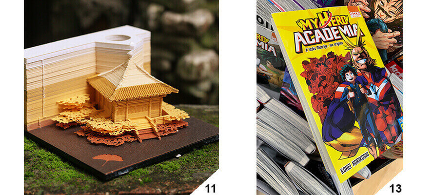
We now come to bookbinding. This is perhaps the aspect to be paid most attention to, especially in complex printed products, but not only because, as we have seen above, sometimes, in the apparent simplicity, there are hidden details to be taken into account that make all the difference. Even a simple card, business card or invitation might not have been just cut on all four sides. It might be a bit of a borderline case because there is no reason to die-cut when you can go to the cutter, which costs significantly less. However, if the required cuts are not straight and the corners correct or only open windows, then die-cutting is necessary. The clue to look for are the sealing notches that the die-cutter requires to not lose the piece in the machine. Special die-cutters do not require seal marks like those used for playing cards, but these are exceptional cases. Where the die-cutter, which has objective limits in terms of minimum dimensions, does not arrive, along comes laser cutting, which allows the paper to be cut by perforating it, almost like embroidery. The advantage is the fineness of the cut; the disadvantage is that one has to accept a minimum of paper burn marks that can be seen on the back of the cut. This is the mark we should look for when we come across particularly fine or bold cuts. An extreme example is the Omoshiroi Blocks, composed of a few hundred sheets, each cut with its own design that, once removed from the block, expose a veritable paper sculpture. A technical masterpiece in which die-cuts and laser cuts create true mass-produced works of art.
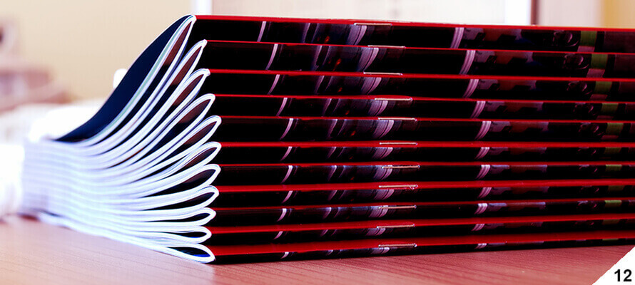
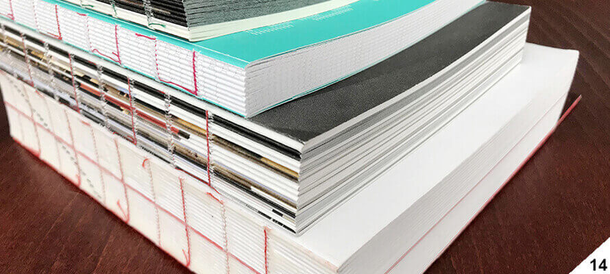
But we should not think that established industrial products are not the result of complex operations and processing. A trip to the bookbindery or to YouTube is enough to discover how many steps it takes to transform a ream of printed paper into a simple paperback volume. The bookbinding industry is now a concentration of efficient technology that has speeded up every step, thanks to the push of digital printing that has made even one-off copies economically worthwhile. Let us start with the most straightforward binding, the simple overlapping of folded sheets, which becomes a staple when the overlapping signatures are held together by a thread. It is worth analysing these types of printed products because there might not be only two staples as usual, or they might be not only folded but also flat, and the thread might be coloured. The staple then has the critical issue of the paper weight limit and the number of pages. Analysing a printed product of this type also makes it possible to assess how the paper behaves when there are so many pages and how much the thickness of the paper influences the so-called "creep", i.e. the shifting of the pages as you move towards the centre. Keeping this in mind means, among other things, avoiding finding yourself with margins that change page after page or graphics that are dangerously close to the cut.
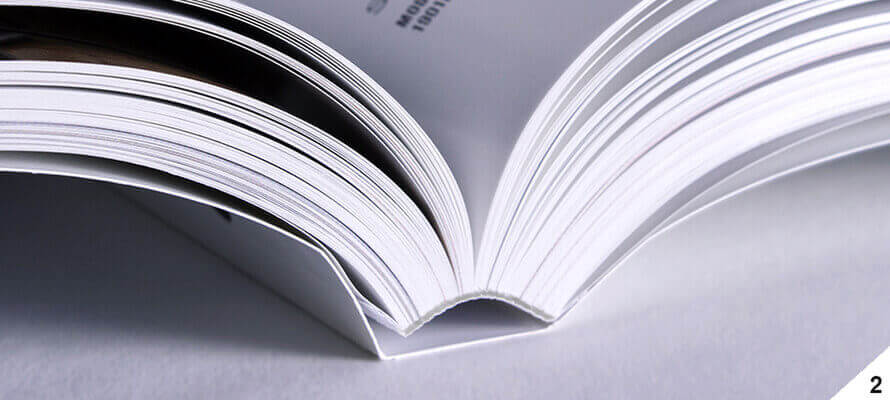
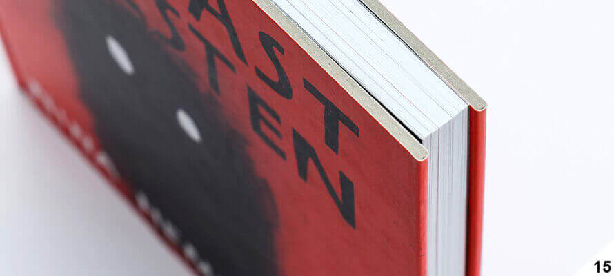
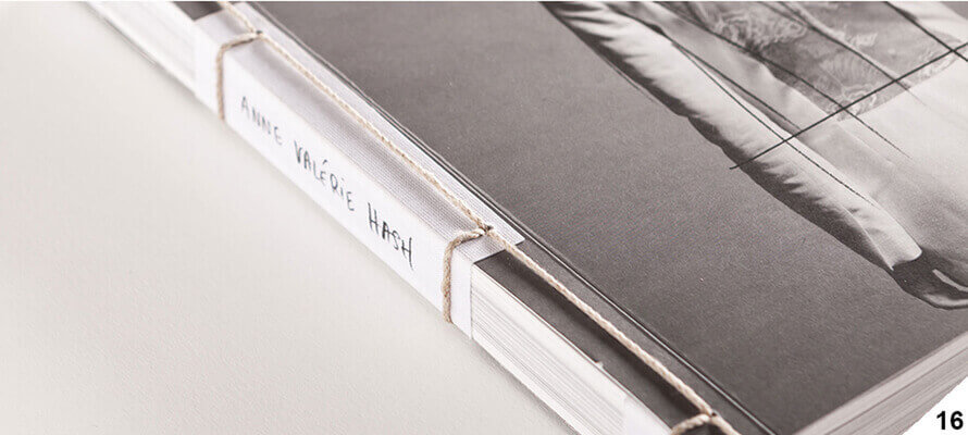
Getting your bearings with paperbacks, on the other hand, is easy. If there is thread holding the markings, then it is stitched thread; otherwise, it is a traditional milled paperback. It is not necessarily the case that a hardback volume is stitched and vice versa. Reverse binding is more expensive, and it is still possible to give prestige to the volume by making a hardback and freeing up the stitching budget for enhancing the cover. This is what typically happens with book publishing. The thread can be seen by opening the pages in the centre or by checking whether the shelfmark can be seen in the spine, drowned in glue, in the binding with live gluing and visible spine. With hardbacks, the question becomes more complicated: certainly, a classic hardback has a cover consisting of the spine and the two cardboard quadrants that are covered and tucked in with paper, leather or binder's cloth, into which the volume is glued with the endpapers. In more valuable volumes, the endpapers are two back covers of different and heavier paper than that used for the interior but can be dispensed with by glueing the first and last pages directly to the quadrants. This traditional version can be complicated at will by adding parts (as many as 13 can be added, including the dust jacket, capitals, bookmarks, slipcase, and padding, to name but a few) or by removing them, as in the open spine binding stitched with thread without a hardback cover and with visible thread. An interesting variation, however, is obtained by raw-cutting the quadrants and exposing the boards or by changing their grammage and transforming them into Dutch with soft board quadrants from 250 to 400 g; into Bodonian with two raw-cut quadrants and applied to the cover of the paperback volume; or again in Japanese, a refined binding executed manually by passing a thread from one hole to the other and wrapping the spine.
